
Dutch Marine Painting at a Glance
By Heloise Pinto
A recent visit to Tate Britain’s exhibition ‘Turner’s Modern World’, featuring several of the artist’s seascapes and marine pieces for which he was celebrated, made me think that this subject in the history of art is little discussed outside of Turner’s later, more experimental and controversial seascapes – this surprises me because, seemingly, when in a gallery or a museum you are never far away from a marine artwork. Whether the relative lack of interest in the genre is due to the frequent absence of human imagery within it, or the fact that narratives are often tricky to understand or require prerequisite knowledge of the history of shipping, or that the expanses of sea and sky do not catch the eye of many in a gallery, or even that the subject matter apparently cannot be dissected for social commentary or religious messages, I am not sure. In this short piece, however, I hope to provide some examples of the great artists of the genre, and their works, from where Turner’s famous canvases came.
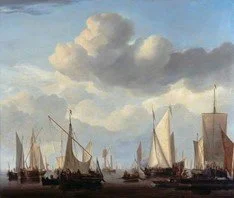
Simon de Vlieger
‘Dutch Men of War at Anchor’ 1601-1653
‘Fishing Boats in a Rough Sea’ 1601-1653
De Vlieger was a seventeenth century Dutch marine painter, influenced by Jan Porcellis and Willem van de Velde the Elder but who incorporated a greater degree of realism in his colour palette when painting. He chose as his subjects harbour scenes, ships at sea, storms, shipwrecks and calm seas, and is can be seen as the connecting point between the detailed pen paintings of van de Velde the Elder and the first forays into the so-called ‘tonal’ style by Porcellis, involving a focus more on expanses of sea and sky, the capturing of the natural elements of the ocean rather than solely on historical military vessels.
He often included great detail in his descriptions of the anatomy of the ships and accuracy of their manoeuvres but also paid lots of attention to the merits of atmosphere in a seascape. What set him apart from his Dutch predecessors was his embrace of a more realistic approach to light in his paintings; he opened up the colour spectrum to include the delicate balance of blue and grey needed to represent the sea. In comparison to Van de Velde the Elder, too, his compositions are much more comfortable; rather than a large number of ships clustered together, with masts and sails often overlapping and some parts of the vessels being cropped by the frame, de Vlieger consistently chose to paint one vessel in the foreground, often in legible detail, and one or more further away, frequently at a perpendicular angle to show the whole body and achieve perspective.
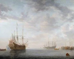
The two examples of his work I have chosen show his range of representation in their dissimilarity; ‘Dutch Men of War at Anchor’ shows the majesty and power of Dutch naval domination at the time, with a sense of harmony achieved by balancing the tones of the water and the clouds. It is a ‘silent’ and proud picture, the masts strike upwards to heaven in a display of confidence. The lack of sails on the men of war allows the artist to show an uninterrupted view of the rigging, and a crystal-clear distinction between ship and sky, as opposed to the second picture.
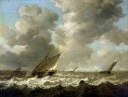
In the second painting, de Vlieger enhances the definition of both the waves and the sky to emphasise the power of the elements instead. The dramatic leaning of masts and sails to the right create pattern in the composition and a unity of objects. The darkening of the sea in the very foreground both displays de Vlieger’s commitment to the realism of his genre and creates a more defined spatial plane just beyond it so that we can focus our attention on the closest fishing boat and its surrounding waves. The low horizon line in both paintings is characteristic of Dutch marine art of the early 1600s and especially frequently used by de Vlieger, who harnesses this viewpoint to map the upward trajectories of his vessels against the sky for dramatic effect. Despite the artist’s naturalistic approach to marine painting, his pictures still retain the somewhat brassy haze of the tonal style which was dominant in Dutch landscape painting in the first half of the century
Ludolf Backhuysen
‘A Dutch Yacht Before the Wind in a Harbour’ c.1680
‘A Storm off the Coast with Men o’ War and Fishing Boats’
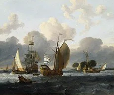
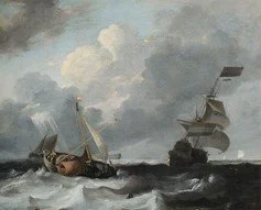
Ludolf Backhuysen was a German-born Dutch artist who worked around Amsterdam throughout his life. He was known to immerse himself in the elements he painted by setting out to sea in a boat when he saw a storm approaching and sketching out the cloud formations and outlines of the vessels before returning to shore and dedicatedly embellishing with paint what he had seen. He was working slightly later than de Vlieger and thus his marine paintings represent the tonal style of landscape to a lesser extent. Rather, Backhuysen’s paintings fall more into the category of the ‘classic’ style, whereby contrast between light and shade is heightened and the composition is arranged around a clearly defined monument such as a cluster of trees, buildings, or in this case, several ships. Backhuysen’s articulation of the vessels – again of all types – is noticeably sharper, cleaner, and concentrated in terms of the range of colour and shadow used. The artist tended to focus his attentions, however, on the depiction of theatrical narratives at sea, mostly in dramatic and stormy conditions. Backhuysen’s style allows him to draw upon a wider range of colours and in so doing accentuate the brightness of individual sails catching the sun and the pale foam of the stormy sea.
Willem van de Velde the Younger 1633-1707
‘Shipping in a Calm’ c.1658
‘An English Ship in a Gale Trying to Claw off a Lee Shore’ 1672

If Ludolf Backhuysen can be seen as the master of the storm, then Willem van de Velde the Younger is the master of the ‘calm’. Undoubtedly the most widely known and appreciated of the marine painters of the Dutch Golden Age, van de Velde was born in Leiden in Holland, the son of Willem van de Velde the Elder, who taught him along with Simon de Vlieger from a young age. The father and son moved to England by 1673 where they were employed by Charles II to paint sea battles together. Van de Velde the younger developed his own style, however, and became known for his tranquil, carefully composed scenes filled with vessels and masts drifting in the calm water. The monumentalism of his ships comes arguably from the classic style, but he also describes his them with a naturalist flare and a crisp realism on top of the striking definition also seen with Backhuysen. Such was van de Velde’s posthumous renown in Britain in the eighteenth century that in 1801, J.M.W Turner painted his celebrated ‘Dutch Boats in a Gale’, sometimes called ‘The Bridgewater Seapiece’ due to its commission by the 3rd Duke of Bridgewater, in deliberate imitation of van de Velde’s ‘A Rising Gale’. The Duke had ‘A Rising Gale’ in his possession, and commissioned Turner to paint a companion piece, to which challenge Turner responded by painting a near mirror-image of the Dutch piece, only much larger (in defiance of the tradition of companion pieces matching each other in size) and much more theatrically.
ST.ART Magazine does not own the rights to any images used in this article